

Role
UX Design
UI Design
Deliverables
Survey Analytics Competitive Analysis Personas
User Stories
User Flows
Site Map
Wireframes
Usability Test
Mid Fidelity
Time & Tools
Client: Transportation Agency
Duration: 3-week Agile Sprint
Tools & Software:
Figma, Maze, Optimal Workspace,
Usability Hub
Problem
Due to expansion, numerous bus routes have been recently added. Many of those routes stop at the same bus stop. Before the new routes were added, riders could simply rush to the stop when they saw a bus coming—but that doesn't work anymore because it might not be the bus that they're expecting.
Solution
1. Ensure that any rider can tell when each of the buses arrives at the Washington & State bus stop.
2. Ensure that all riders can tell how much time they have to get to the Washington & State bus stop before the bus they need arrives at that stop.
3. Allow riders to select one of seven bus lines to see a list of its future arrival times at the Washington & State bus stop.
Design Process
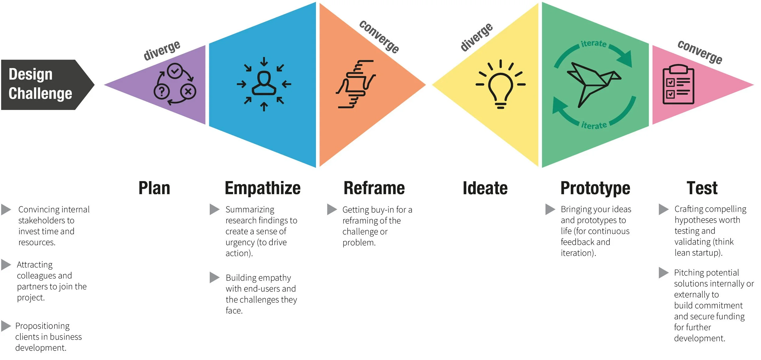

Timeline

Target Audience
Employing user surveys launched through social media platforms like LinkedIn and Facebook gave me qualitative and quantitative data based on my target audience.
With the research and data collected through survey reports, 43% of people riding the bus are students between the age of 20-35, who have jobs and attend college.
A 53% pool of commuters travel downtown because there’s nothing available for housing where they work, traffic continues, and parking limitations make public transportation more convenient.
.

I conducted interviews with different bus riders to give me valuable insight, and pain points that would identify key user experience knowledge.
User Interviews


User Research
Performed competitive analysis, conducted interviews, launched surveys, and leveraged the data to define the user persona. Usability testing of user interaction will be ongoing to iterate our design for improvements and adapt to the times.
Accessibility
Designed with the user in mind, easy-to-use interface with a tutorial onboarding walkthrough to get you comfortable with finding your destination and accessing the features in the app.

Competitive Analysis


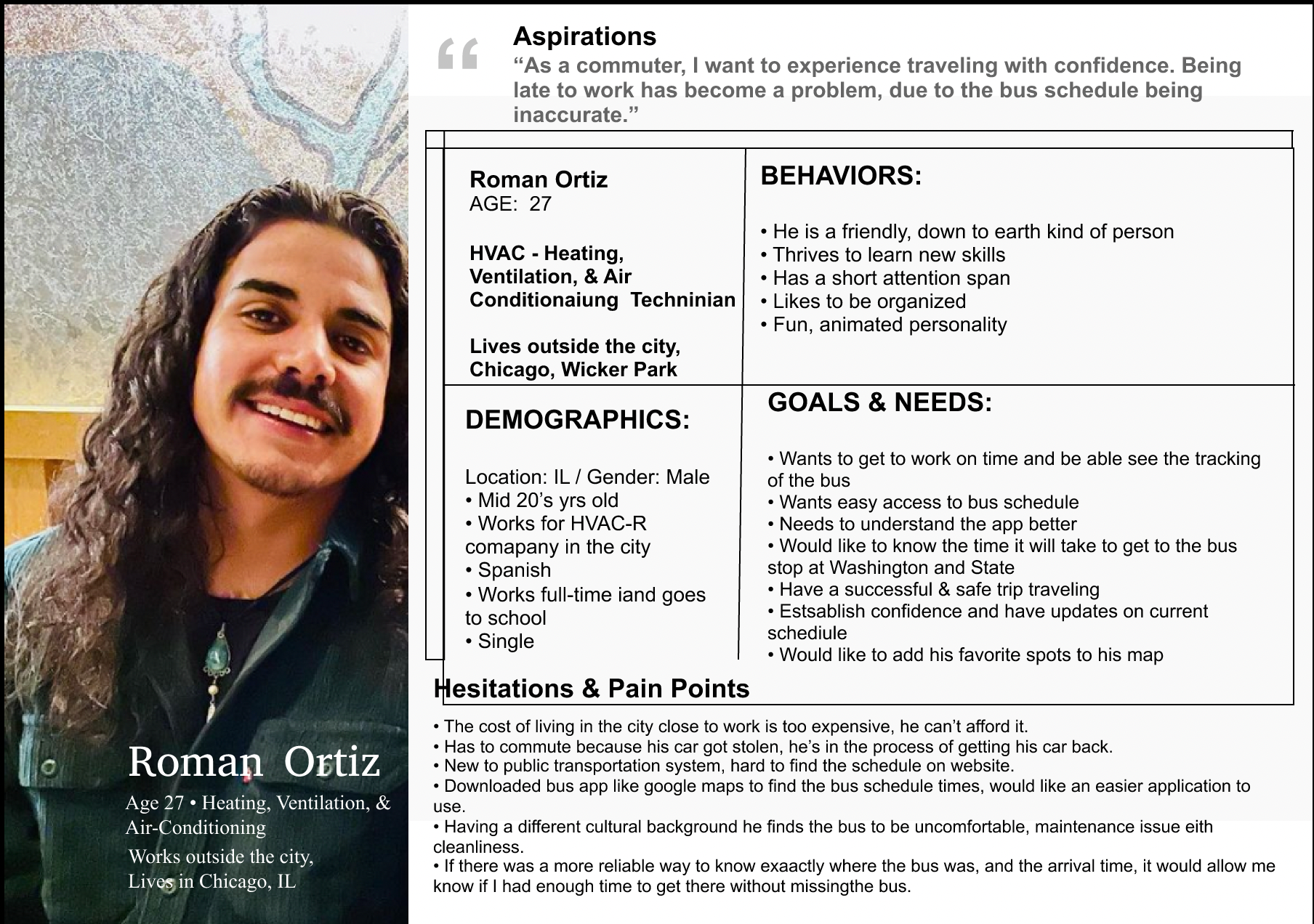
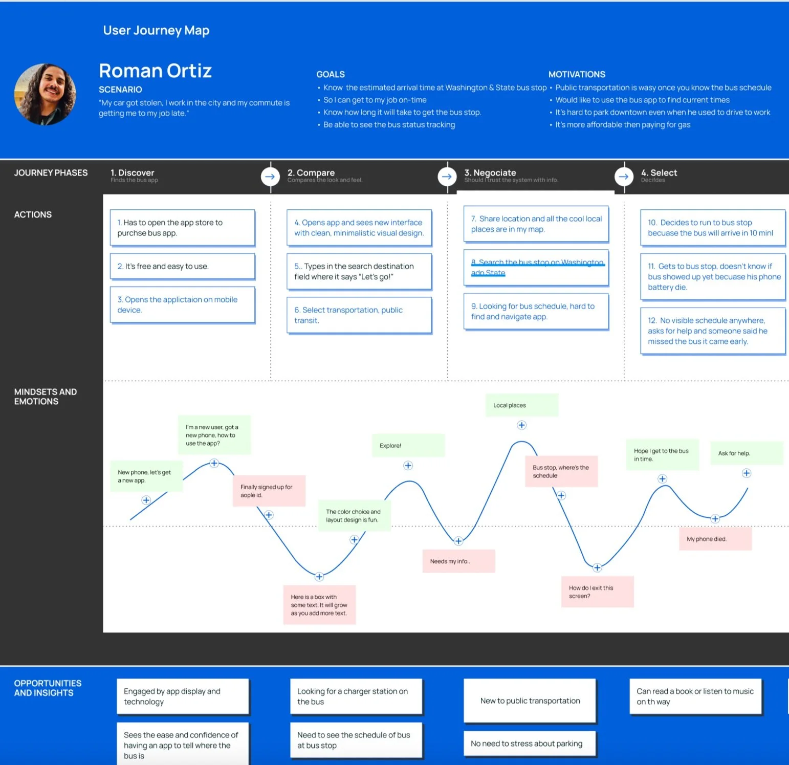
Empathy Map

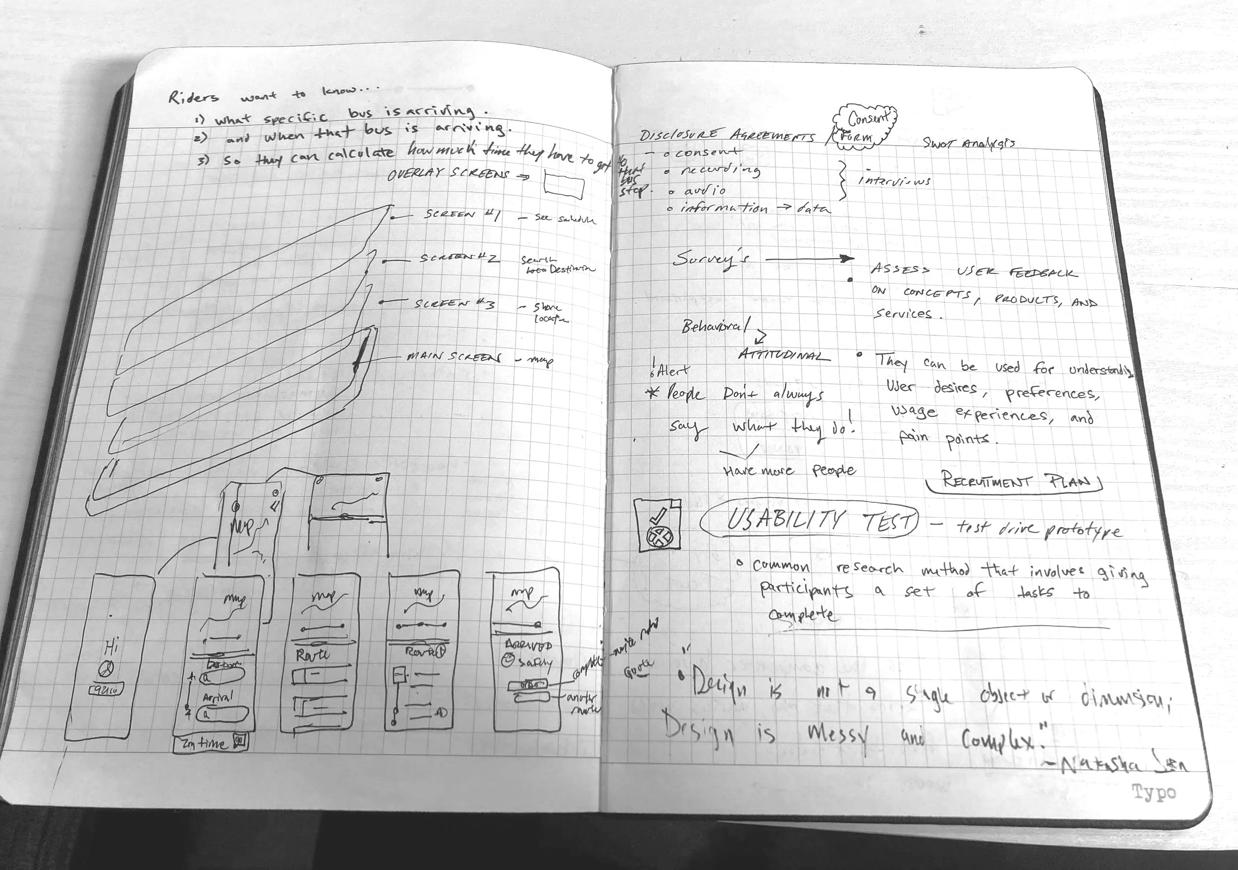


Journal Sketches
I compared Google Maps, Citymapper, and Transit to find inspiration for visual interface design ideas.
Sketching wireframes is my favorite part of the design process through the Develop phase of the project, utilizing layout and grid systems for alignment and consistency.
User Flows

I created User flows to understand how user stories would become the building blocks to make the wireframes.
Having a task like looking up the next bus time would enable the site map to be established.
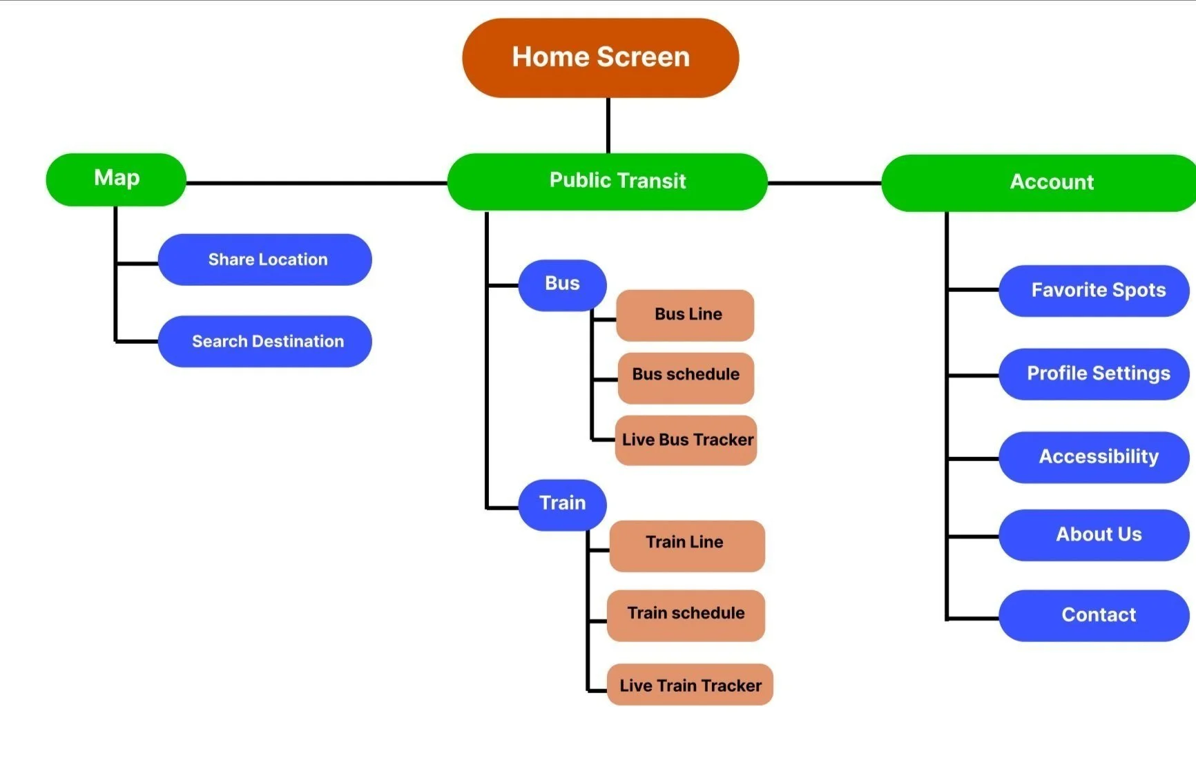
Site Map
Low-fi Wireframe and Prototype

Content Strategy
Implementing the Business Requirements to keep the design clean with a minimalistic feel is the intended goal. Function before fashion is the approach to this product development, focusing on accessibility and consistency.
Usability is the primary concern, establishing a strong visual hierarchy and balancing the cognitive load by only displaying essential content to make navigating straightforward for the user is our intention.
Usability Tests & Iterate
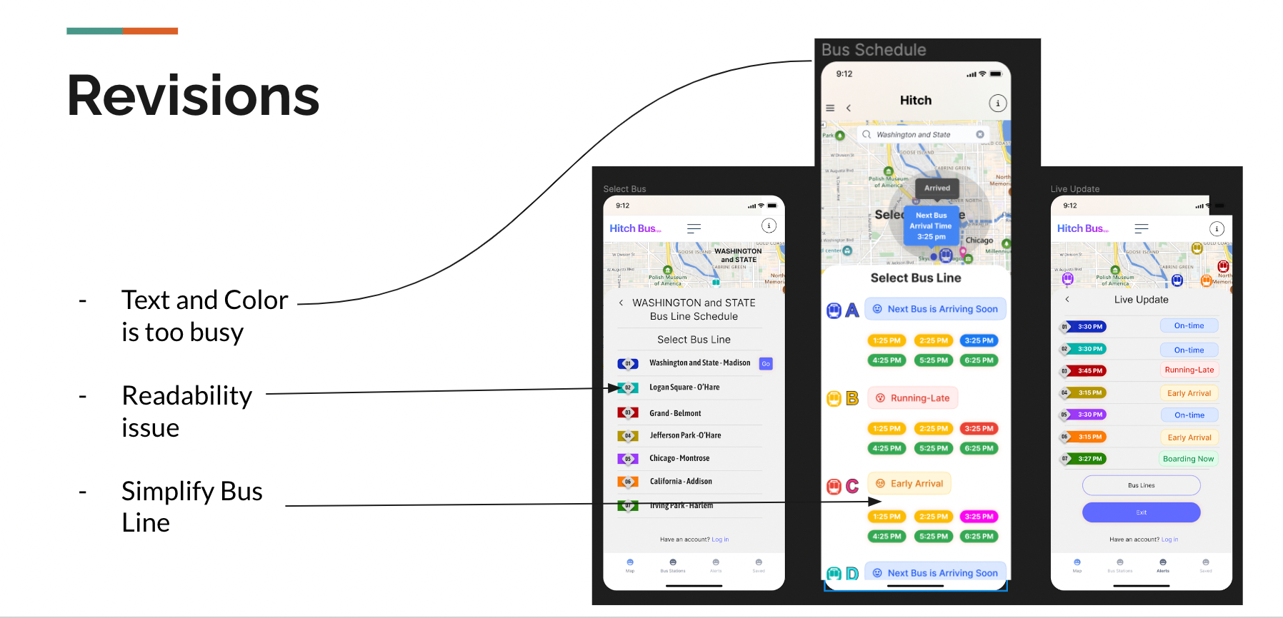
Tester #1 Quote Source
"I love the interface! The colors and typeface work well and it looks like a beautiful app! Brighten the map and make it larger”
Tester #3 Quote Source
“Enjoyed the visual aspects of the application! I just originally got a little confused when clicking on the search option for the next bus.”
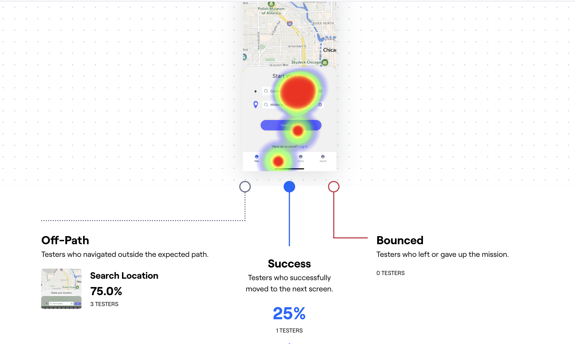
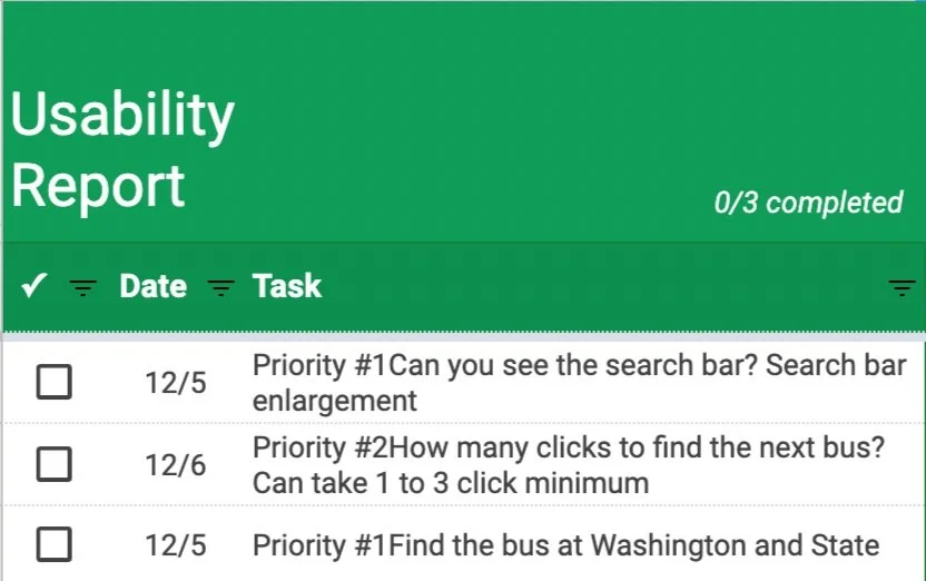
Using my high-fidelity wireframes with 9 participants, users were tested on the following criteria.
1. Finding the schedule for Washington & State.
2. Finding how much time they have to get to the bus stop
3. What is the next bus at Washington & State.


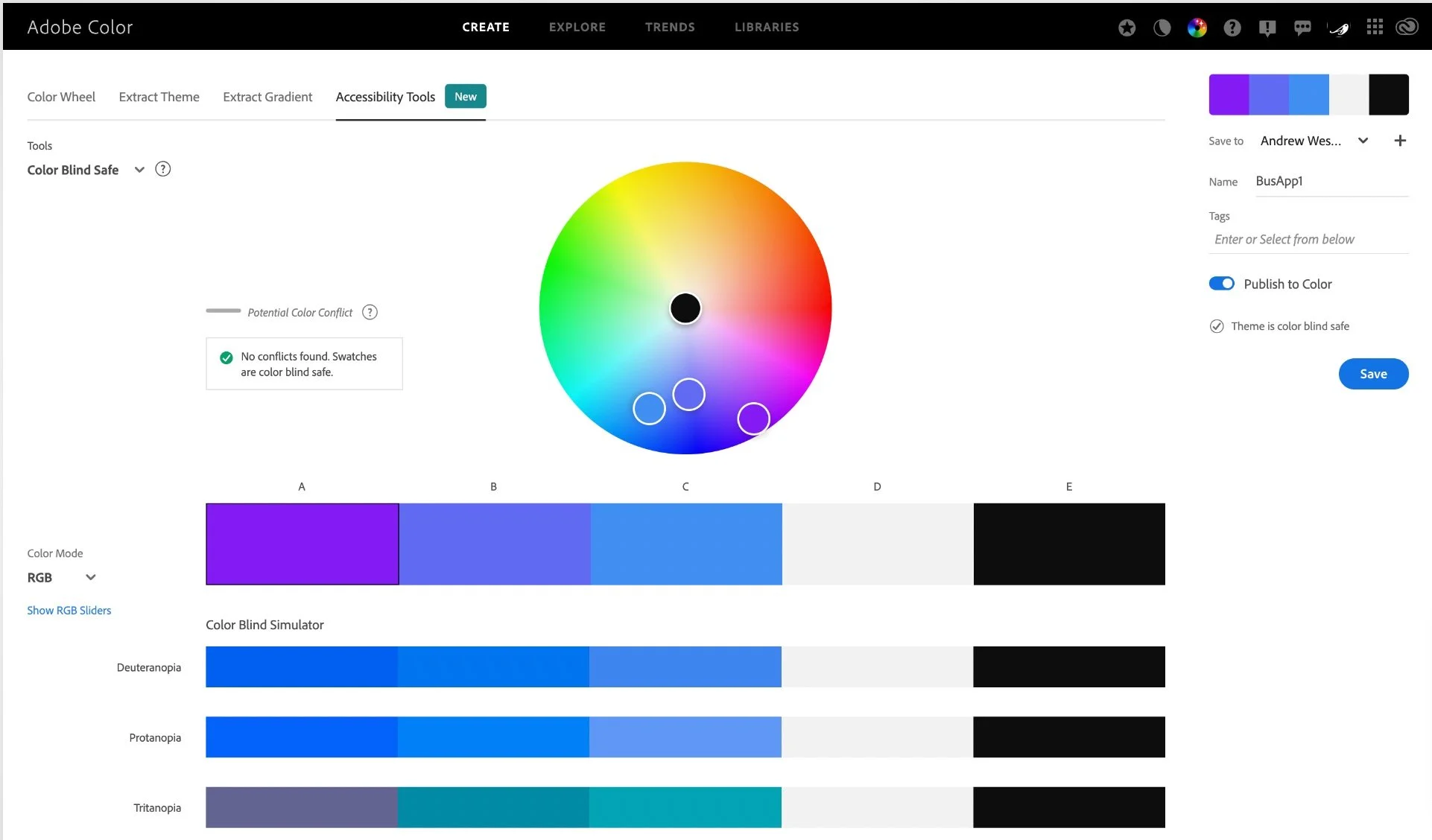
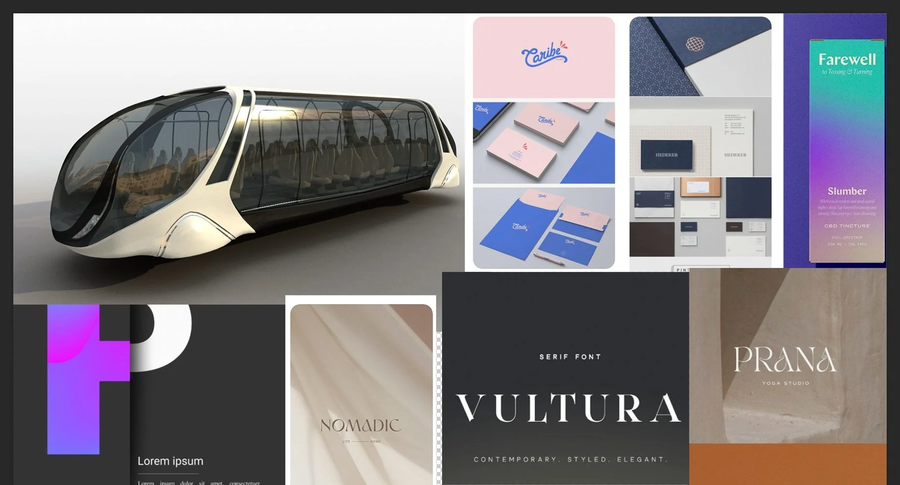
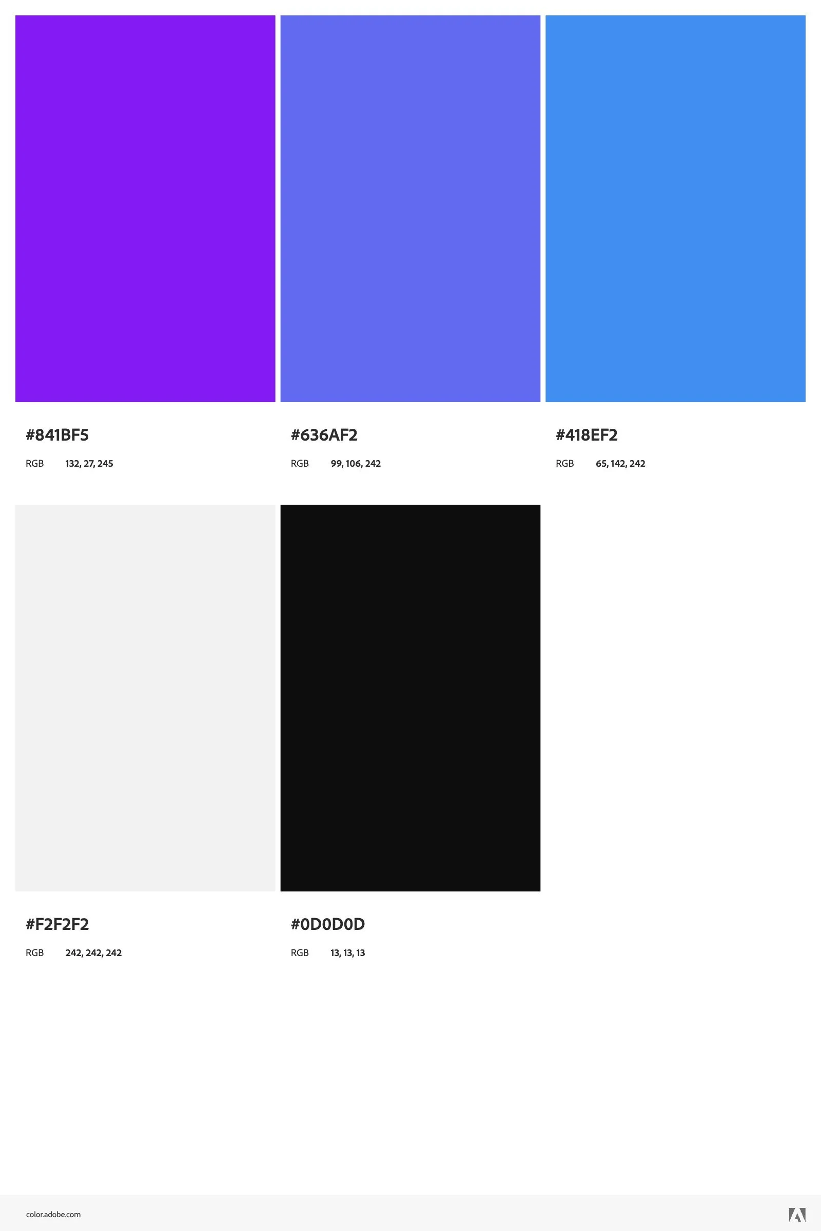
Color Palette & Mood Board
I was looking for a minimalistic feel that would be sleek to the design. Here is some inspiration drawn from my visual ui library.
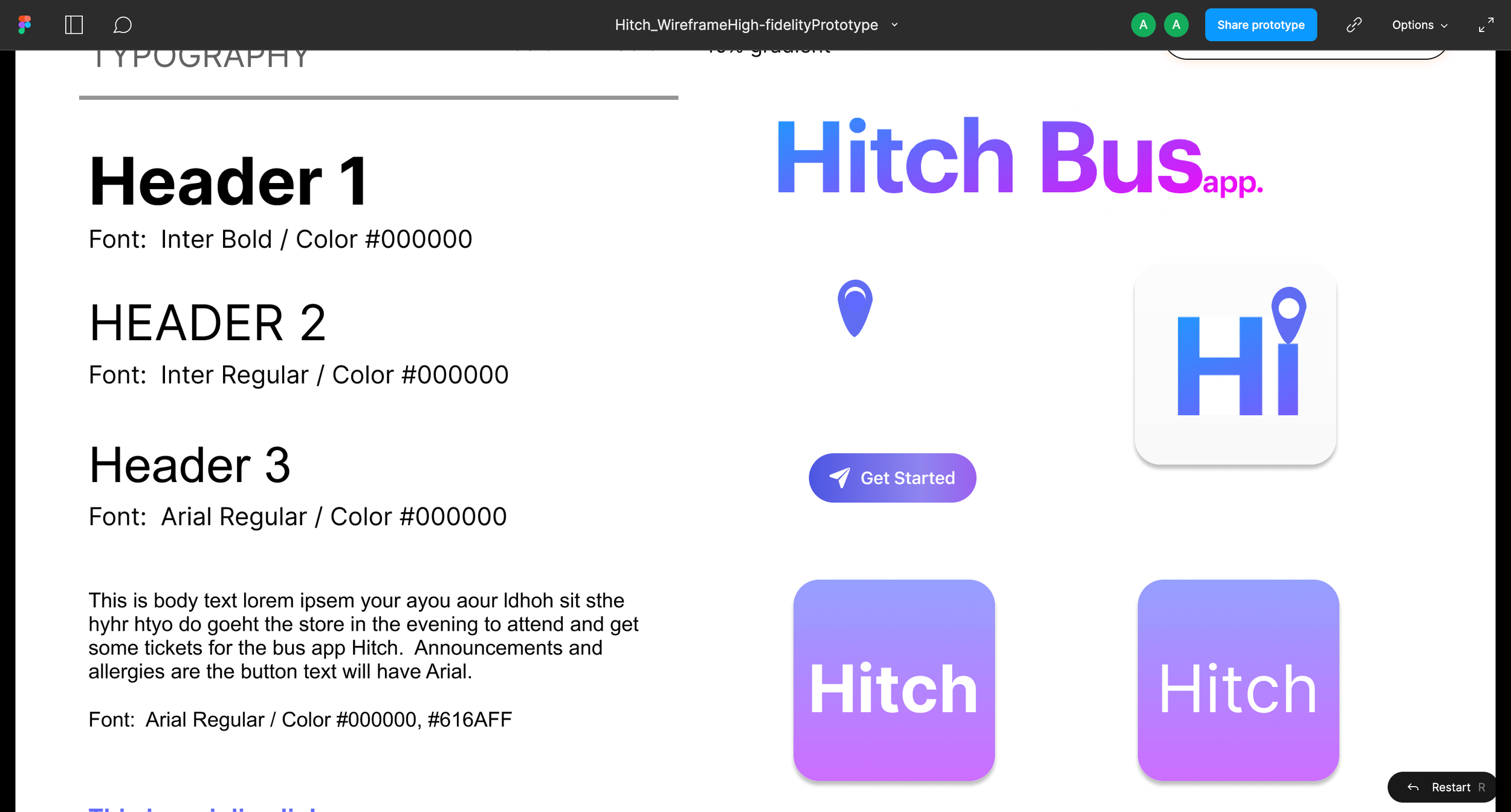
Style Tile
UI Design - Logo & Icon
Incorporating empathy in design and accessibility in color palette AAA compliant.
Early Mock Ups
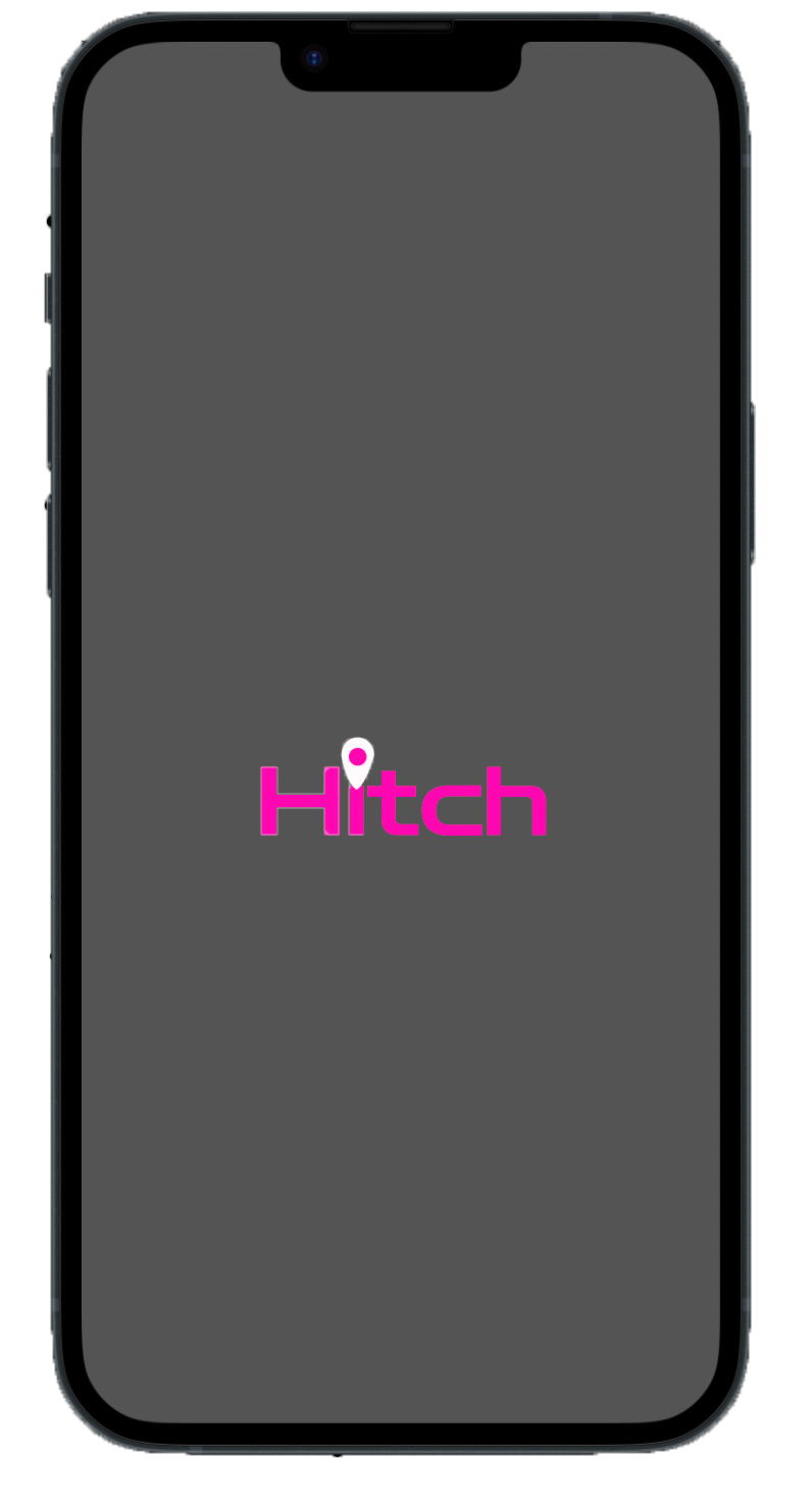
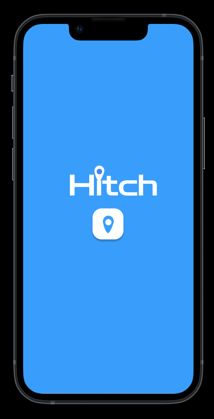
The initial color and mockup weren’t matching the brand and research on accessibility needs. This was an indicator after testing #1 as ideas changed with research and testing.

Final Thoughts
Creating an end-to-end mobile app for a client was certainly a big project. I enjoyed the agile workflow and sprint of this project. I learned to have a plan, iterate revisions based on the outcome of the usability reports, and use empathy to find solutions to make the experience fun and enjoyable to use.
In conclusion, I learned upon the launching of the Hitch Bus app that continual monitoring of the user experience will be ongoing to improve and adapt to the times.

Plans For Development
If I had more time I would design the intuitive map to be scrollable and have a search database to feel more realistic for the user to find new spots and upload content. I would plan to add a settings page, however, these features were out of scope for this project.

